
Beverly Castle Academy's Website
- Project Showcase for Bloc.io
- Responsive Web Design & Development
- Building Sitemaps
- User Research & UI Design
- Prototyping Wireframes

For my Project Showcase for Bloc, I redesigned BeverlyCastleAcademy.org to create a better user experience by using a responsive web design. This project included a fresh and lively color palette, updated typography, restructured copy, a new logo, and a reorganized sitemap for a better user experience.
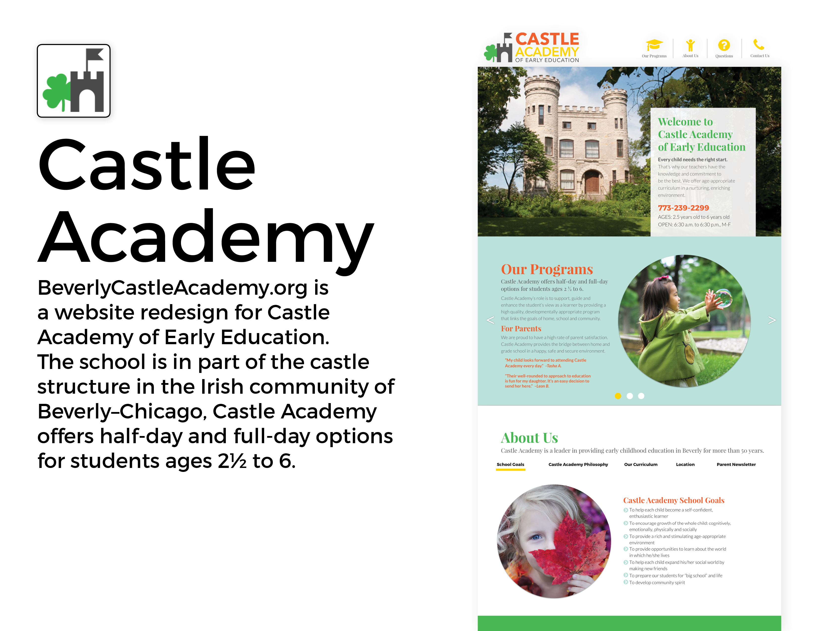
Product Showcase goal: Design and build a responsive website to promote a product.
Beverly Castle Academy's redesign challenged me to think beyond a static page and build an experience that users will want to come back to. This project reinforced the skills I learned during the foundation portion of the Bloc design course, such as how to find solutions with research and user testing and how to prototype and create interactive experiences.
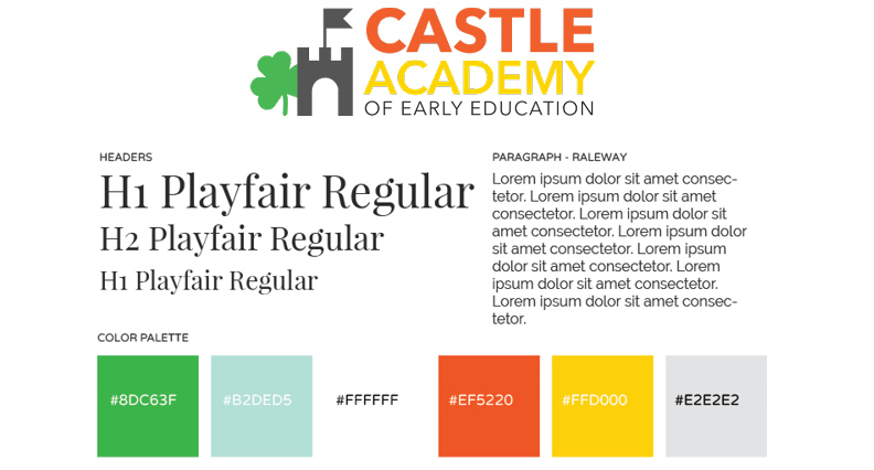
I simplified this logo to include a castle and clover icon to represent the iconic Irish castle-house in Beverly.
The color palette is fun and youthful, but also takes on an academic look when paired with the Playfair typography.
I used this color scheme to set a better tone for the academy.
As a designer ...
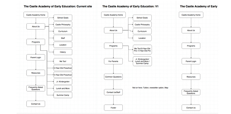
Using Draw.io, I restructured this website to become a one-page, responsive website.
The current structure is shown at left. My first revise is center. My second revise, at right, is the final version.
Click the photo to view the site map on Draw.io.
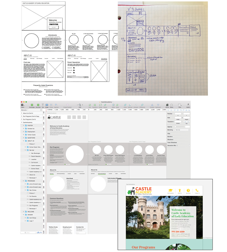
I started sketching rough ideas of my prototype in my notebook, which lead me to create version one. Next, I drafted a low fidelity wireframe in Balsamiq and then analyzed the designs with my Bloc mentor. I then used Sketch to create high fidelity wireframes with more detail. Adding my updated logo, color scheme and font pairings made my wireframes come to life! The last image shows how the design appeared in Sketch.
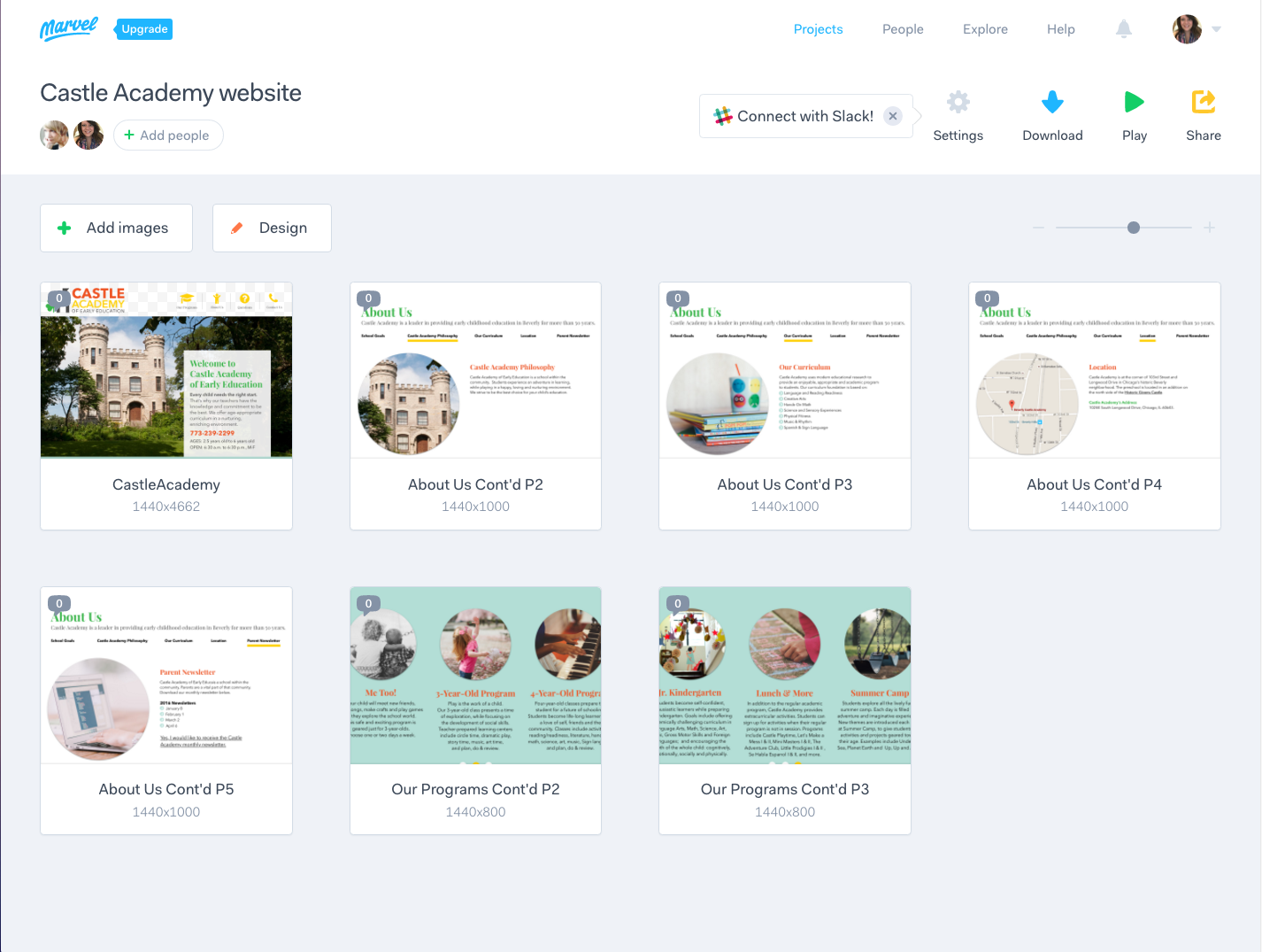
For this project, I used Marvel for the first time to construct and test my interactive prototype. I had a few learning curves using this app to try to show left-to-right navigation within a standing web page. However, I was able to test out other new navigations and hotspots. I look forward to learning more about Marvel. View my project on Marvel.
I really enjoyed working with my mentor on this redesign. I love how the website came together using better user navigation, colors, and fonts. I will continue building on the responsive web design skills I learned from this project. View this project on my Github pages.