Charitable App
- IOS App Development
- User Research & UI Design
- User Personas & User Flows
- Low Fidelity and High Fidelity Wireframes
- Interactive Prototyping

Charitable is the first app I prototyped. This project challenged me to think about user processes in a new way. I had to think about the two main user groups and their main functions: how a fundraiser can collect donations and meet goals; and how a donor can search and contribute to specific causes.
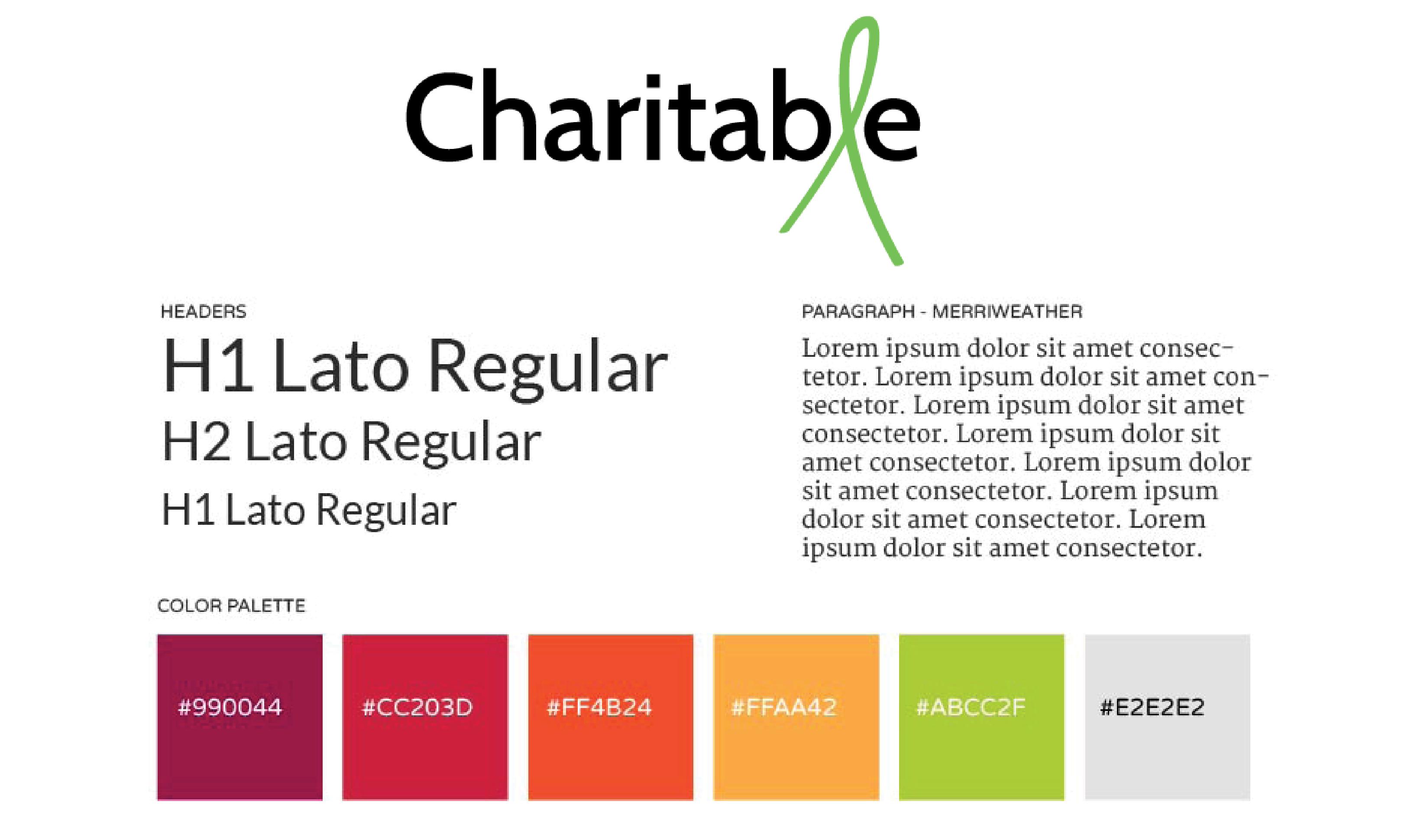
I designed Charitable’s logo to include a ribbon in the title, for users to automatically recognize its association with charitable causes.
I used bright colors paired with a neutral gray to give it an active feel.

As a fundraiser ...
As a donor ...
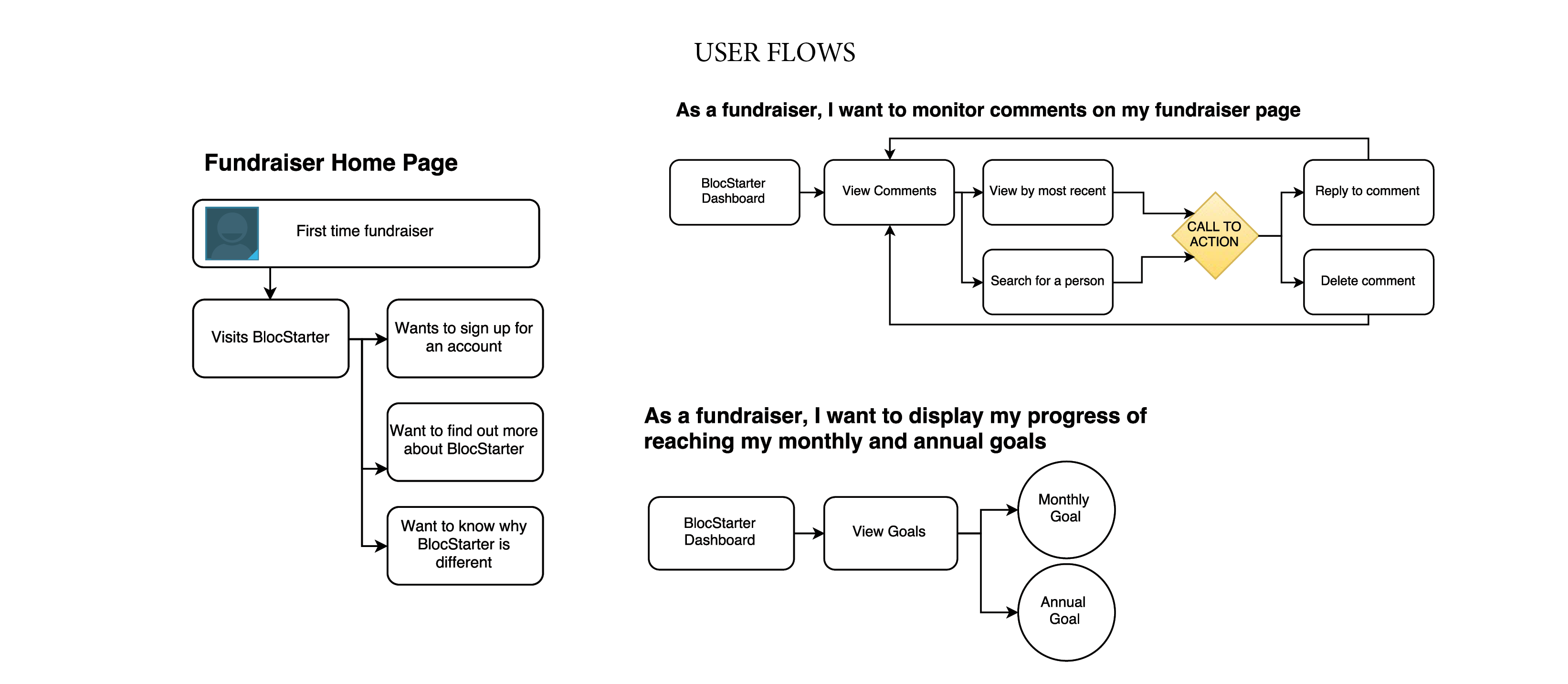
Using Draw.io, I created many user flows for the fundraiser and the donor. Each type of user had a unique experience. I mapped several different user flows, and then concentrated on a smaller set of those flows.

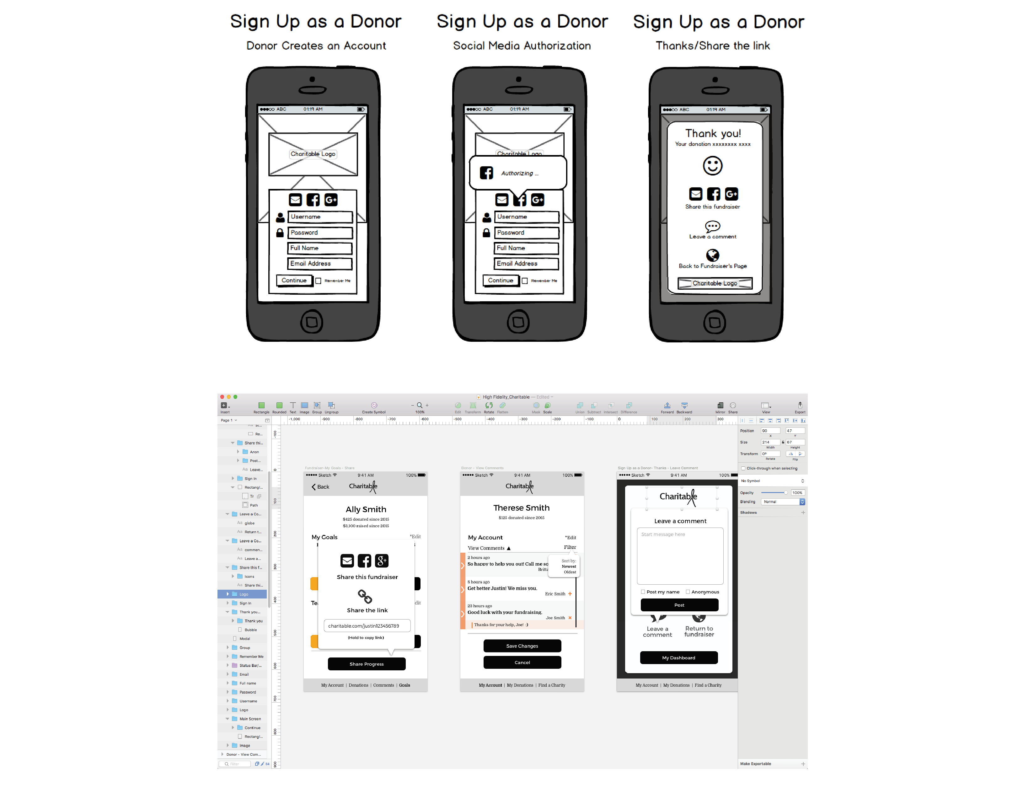
I sketched out my ideas on paper and then added them to Balsamiq to create low fidelity wireframes. I used those to design my high fidelity wireframes in Sketch. Here, I added spot color, icon details, button details and more structure.

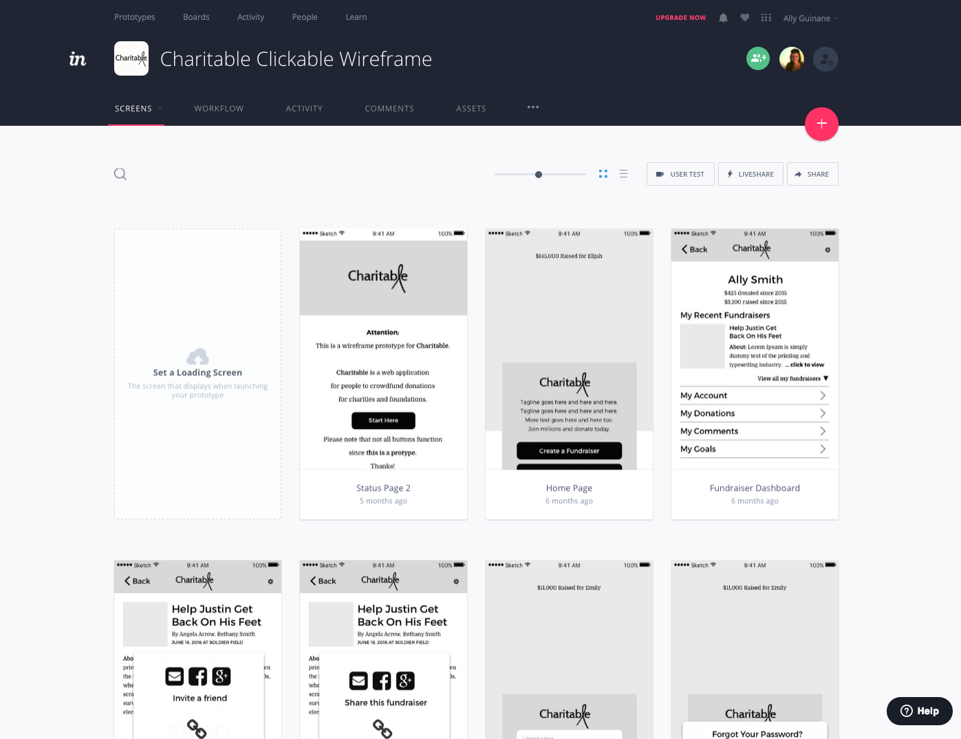
I uploaded my high fidelity wireframes to InVision. I then added interaction to my prototype to show the user's journey. This was one of my favorite parts of the project because I could really see the app coming together. It was challenging to get the user back to the home page everytime. I used a lot of my project time making sure the user wouldn't get stuck on a page. View my project on InVision.

This project was a huge learning curve for me. I designed and prototyped a total of 48 screens on InVision. Although I did not code this project, I was able to spend a lot of time learning how to best serve the user, build interactive prototypes and solve issues that pop up along the way.
Check out this project on InVision.